Griping about the Clock app
I'm a heavy user of Apple's Clock apps on the iPhone and Mac. (They're called "Clock" but also handle alarms, stopwatches, and timers.) They do many things well and many things badly. This post is about the bad stuff.
- When you make an alarm, it adds an entry to your list of alarms, even if you don't set it to repeat. I currently have 108 alarms on my phone's list, even after culling some. This is annoying and makes it harder to figure out if you have live alarms.1
- When a timer goes off on the Mac, the only way to silence it is by manipulating the notification that appears (either dismissing it or selecting an option from its menu). This is both annoying and confusing: annoying, because the targets are small; confusing, because it violates the expectation that notifications are notifications, primarily to be consumed and not interacted with. (Even quitting the Clock app doesn't stop the noise!)
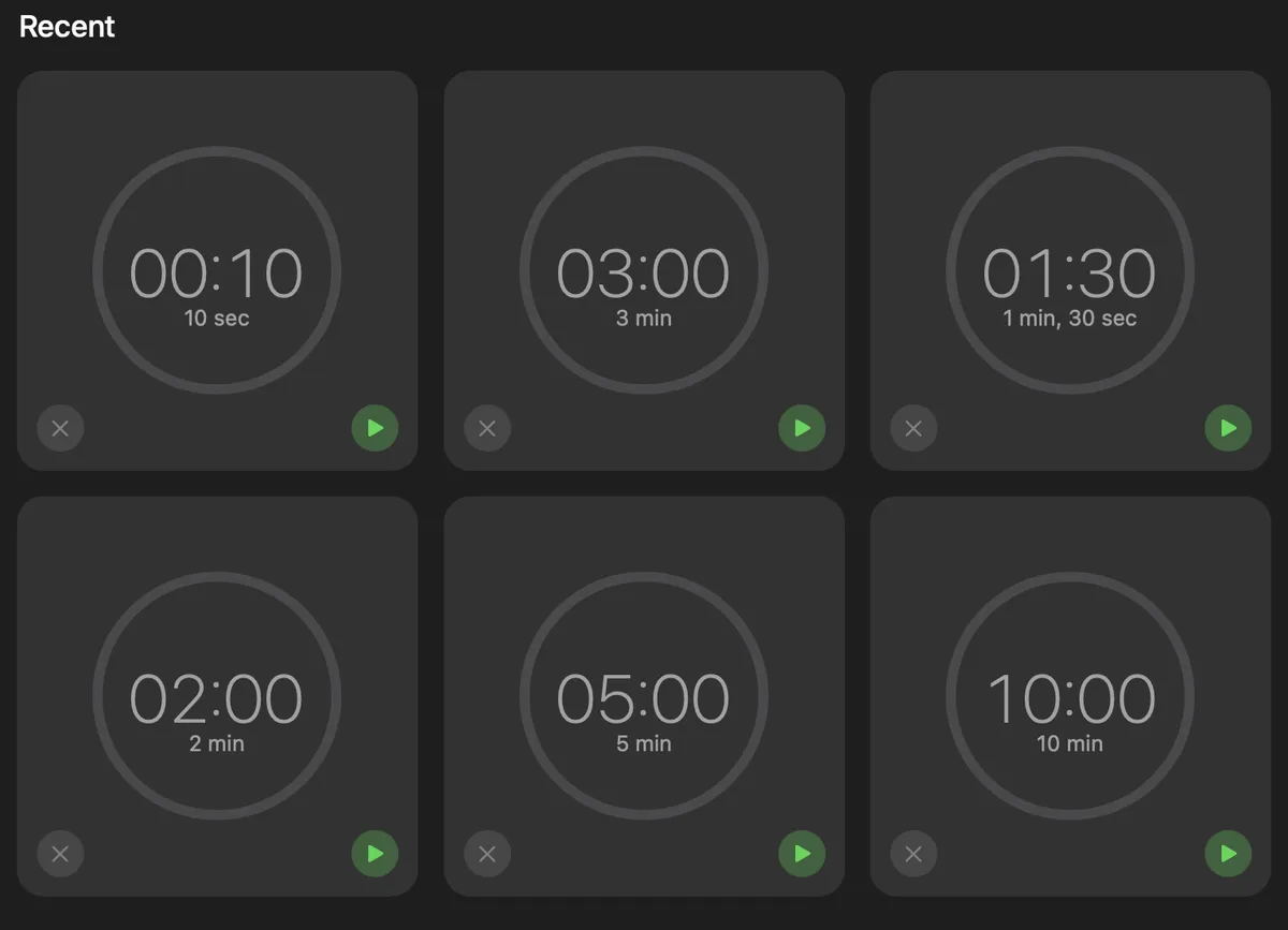
- The most important reason to display a big grid of recent timers, by far, is to facilitate their re-selection. But you can't do that by clicking the big square; you need to hit the tiny green arrow. Most of this area is not available as a target:
- It's hard to figure out that clicking on the box that says "Timer" will let you give the timer a name. If timers really need to support naming,2 the text and design should make it clearer that you can give a timer a name here.
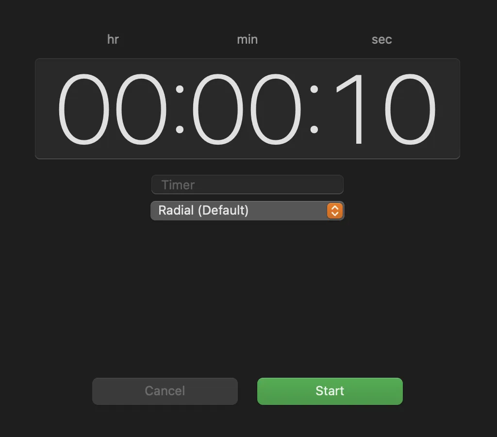
- There are too many small design problems to list, but I'll list a few: The sound dropdown is slightly, annoyingly wider than the text field for the name. The labels
hr,min, andsecon the timer selection don't look good tiny and all lowercase; those labels probably aren't necessary at all. Meanwhile, over in World Clock, time deltas are rendered as (e.g.)+3 HRS(in majuscule). The default labels (e.g,10 secin the top-left box in the screenshot above) are redundant. Finally: when I select Timers (on my Mac), I see a disabled left-facing chevron to the right of the stoplight. It only appears when I select Timers. I cannot find a way to enable it. I don't know what's going on here.
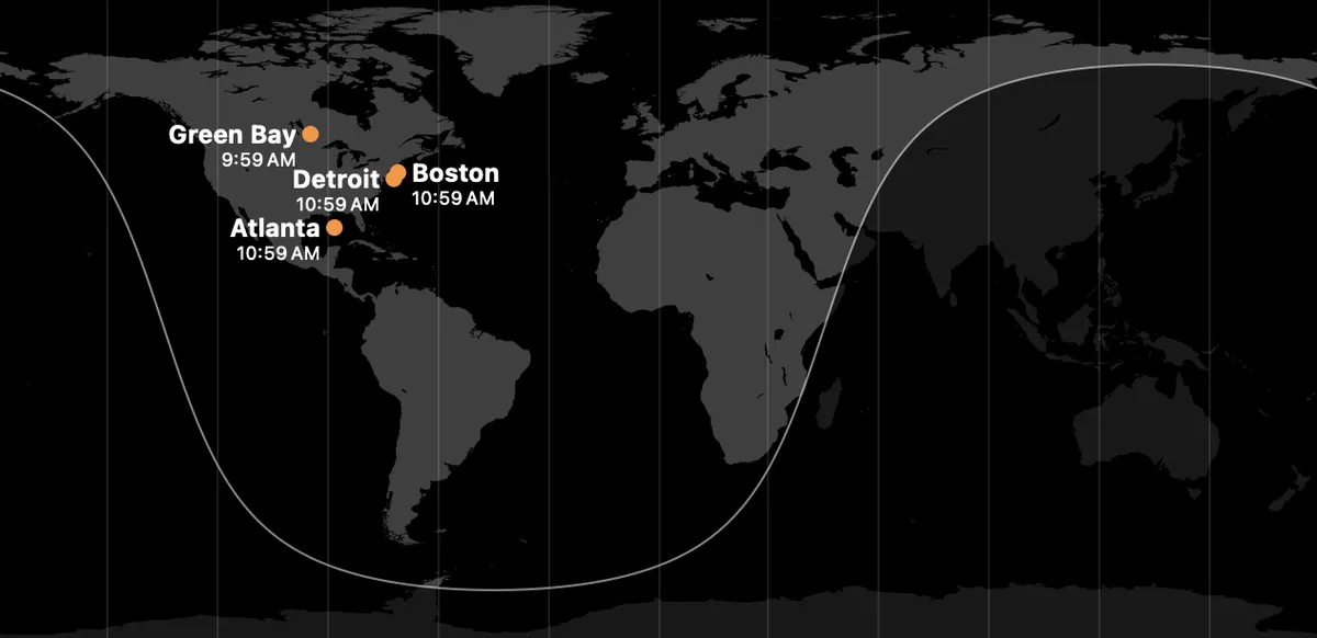
- This image suggests that (i) Boston and Detroit are adjacent, (ii) Green Bay is far northwest of Lake Superior, (iii) Detroit is on the East Coast, and (iv) Atlanta is in the Gulf of Mexico. Those are all false. Note that it's a sneaky-hard problem to display arbitrary subsets of major world cities correctly like this, but (i) this is nowhere near the best way to do it and (ii) the display communicates a precision that is not there. They should either do better at locating the dots or choose a display that does not suggest accuracy and precision they don't achieve.3
- Perhaps most importantly, none of the above is governable via settings. The user is stuck with these bad default behaviors.
Programmers benefit from thinking through issues of design and user experience, even if they are not one's speciality. One thing you'll learn is that it's almost impossible to write a few hundred precise words about these things without making mistakes. If you see any I've made, please tell me about them!
This is a good example of how many programming mistakes are actually metaphysical mistakes, but that's another post.↩
Timers can vary in two respects, the duration and the noise you want on completion. Durations already have intelligible, compact string representations. With so little complexity in the underlying object, and already having a good textual way to represent their most important (by far) property, the utility of naming alarms is far outweighed by the extra complexity names create.↩
"Design a system for displaying subsets of major world cities on a map" would be a fantastic interview question. The CRUD and display basics are nontrivial, and there are so many important details to recognize and think through!↩